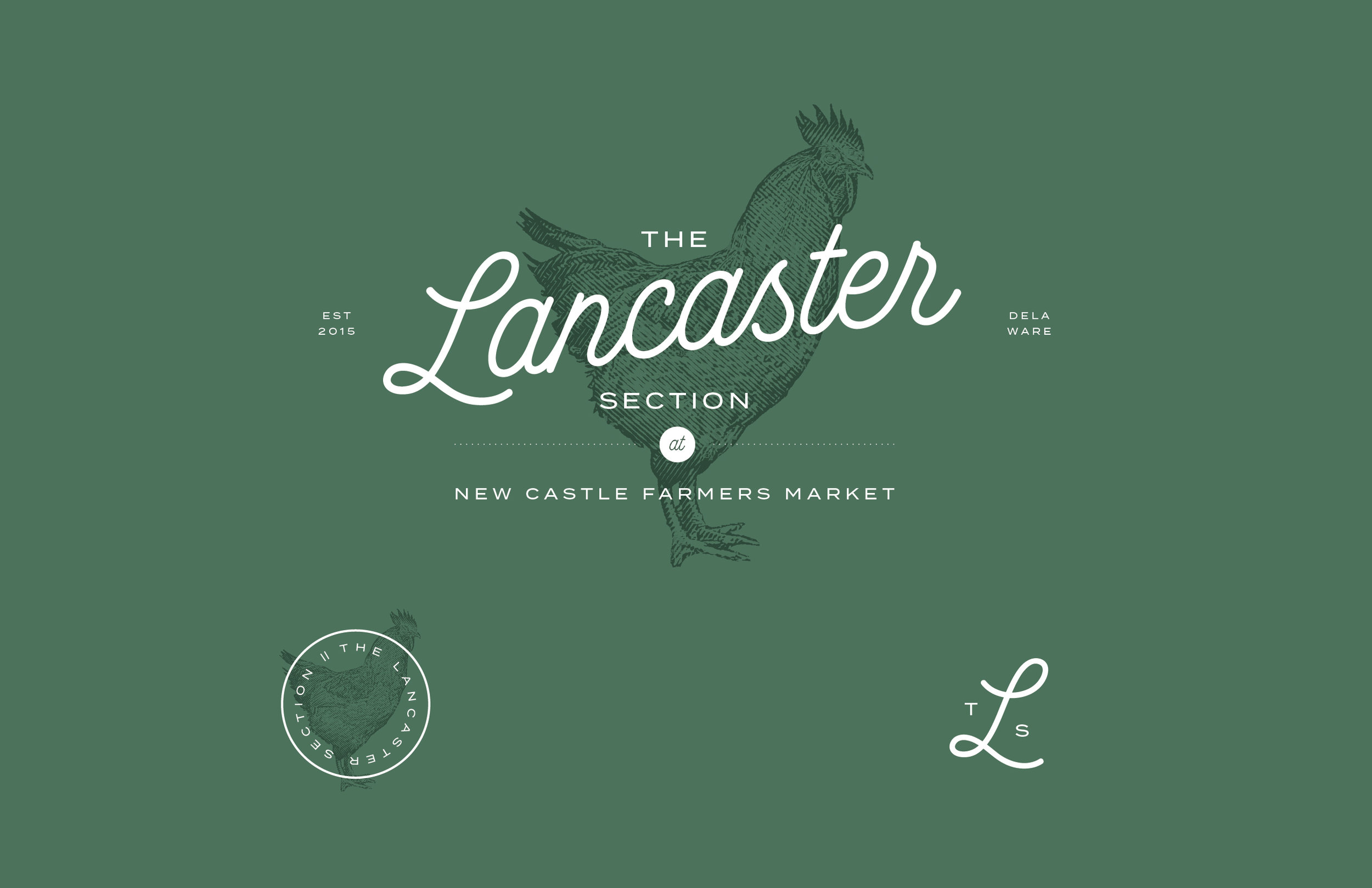
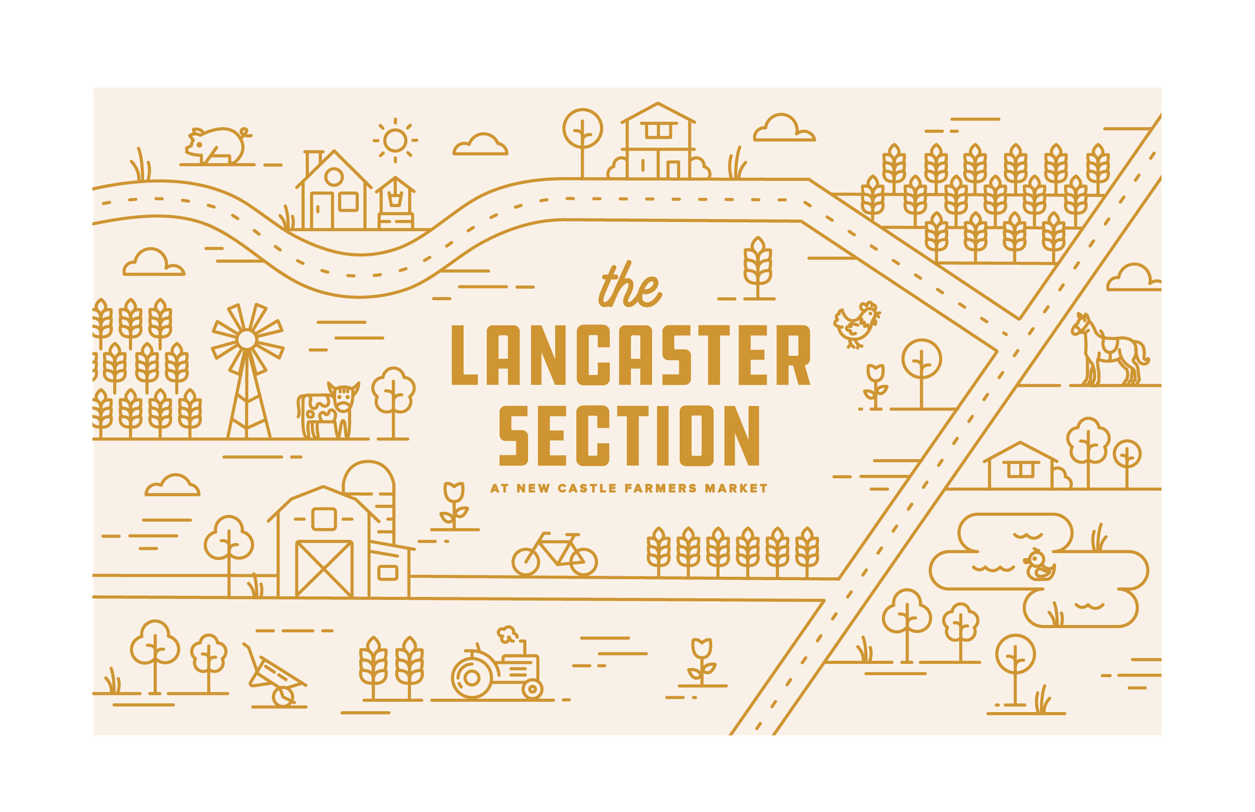
A local pretzel stand owner, and friend (hi, Christian!), reached out for a logo project that would give the Lancaster Section of the New Castle Farmers Market a unique identity. Immediately earthy tones and fun typography lock ups came to mind, and I presented a couple different concepts to get the ball rolling.
The Lancaster Section